Landscape
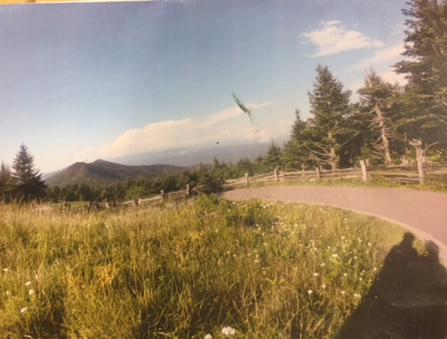
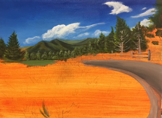
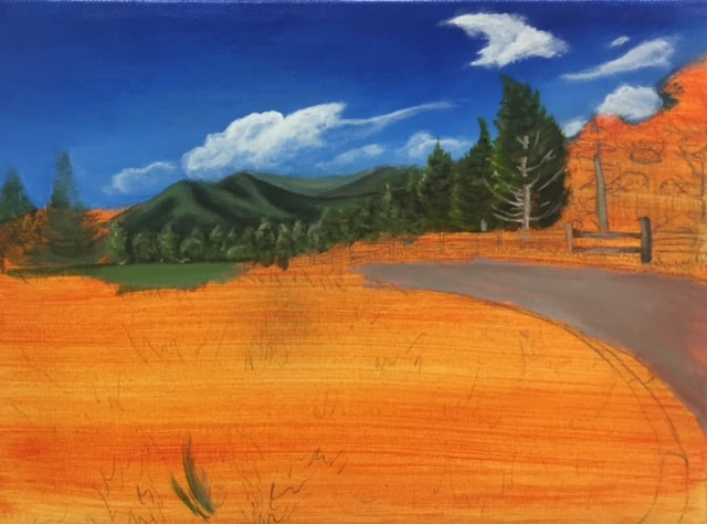
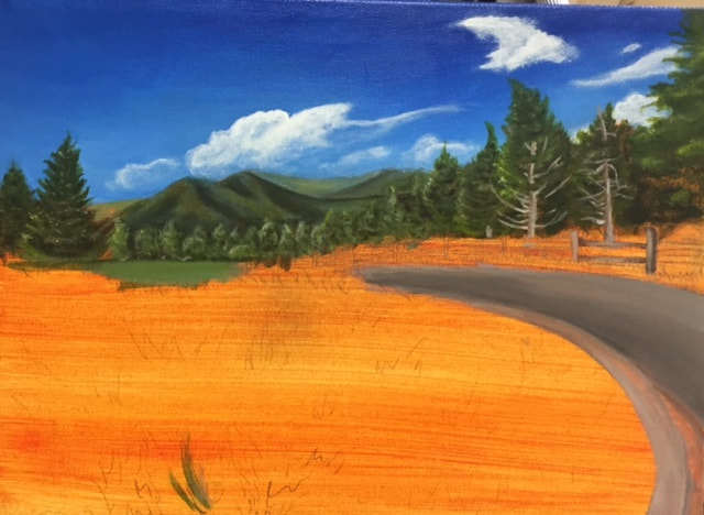
I have loved this project so far!! I'm loving how bright all of the colors are coming across! It all looks so bright and happy. I think I did a really good job with the clouds, they look really nice, and wispy. I also really love the tree trunk, and branches you can partially see throughout the trees. I'm still finishing this project, because of some difficulties I'm experiencing with the foreground. I can't find a way to get enough detail without trying to make it look so perfect. I'm attempting different ways at getting it to look its best. My absolute favorite part of this piece so far is the tree on the far right. I think that tree has a lot of nice value, and I love all of the little branches sticking out all over, it makes it look so much more realistic than it would have otherwise. I think if I could re-do this project, I would pick a completely new picture. as much as I love this one, I think there's too much green. There's not a big variety in the coloring of this picture, which makes it kind of boring to paint.
I have loved this project so far!! I'm loving how bright all of the colors are coming across! It all looks so bright and happy. I think I did a really good job with the clouds, they look really nice, and wispy. I also really love the tree trunk, and branches you can partially see throughout the trees. I'm still finishing this project, because of some difficulties I'm experiencing with the foreground. I can't find a way to get enough detail without trying to make it look so perfect. I'm attempting different ways at getting it to look its best. My absolute favorite part of this piece so far is the tree on the far right. I think that tree has a lot of nice value, and I love all of the little branches sticking out all over, it makes it look so much more realistic than it would have otherwise. I think if I could re-do this project, I would pick a completely new picture. as much as I love this one, I think there's too much green. There's not a big variety in the coloring of this picture, which makes it kind of boring to paint.
|
|
Art Four and AP Art
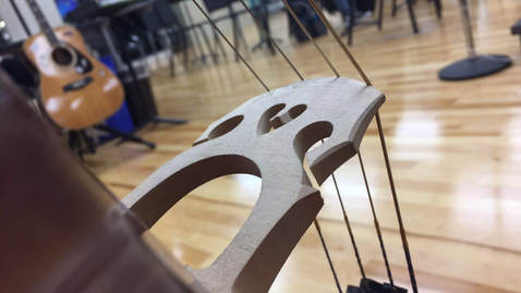
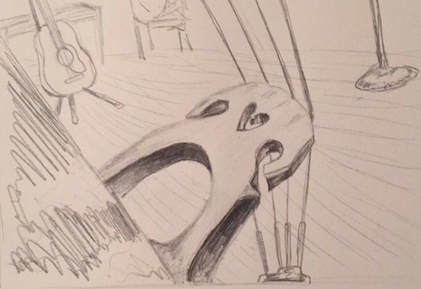
Nature Turns Mechanical!
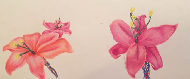
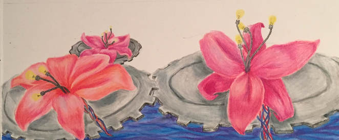
This project kind of stumped me. I wasn't sure what I wanted to do for this. I tried out painting a butterfly with a bunch of gears as the wing, but I didn't like how it was looking. I decided to use prisma colors instead of paint, since I haven't really used anything else all semester. I brainstormed some more ideas, and really really like the one I picked. In this drawing, I was going to have a big field of lilies, and their pistils were wires leading up to a lightbulb. I thought this was a cool idea, so I started drawing the flowers, but then I realized I didn't like how little the mechanical aspect was in the piece, so I changed the gameplan a little bit, and I made them lilies on lily pads. I made the leaves blue red and gray wires, and instead of having a typical lily pad, I had gears, which fit together in the water. I really like how this project turned out, mostly jut because I was able to roll with the punches on this one, instead of just sticking to my original idea, and not liking the outcome. I especially like the petals, and how they look in this piece, I think I captured the flow of them decently. If I could do this over, I would try to make the water look more realistic, as well as the metal. I feel like they looks fine, but just a little bit rushed. Unfortunately, I forgot to take a final picture, and this project is currently at school, where I don't have access to it. I will upload that picture once we get back in school.
Animal Portrait!
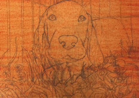
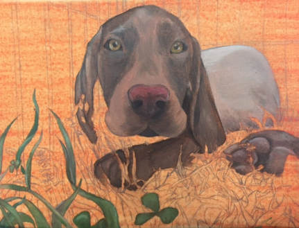
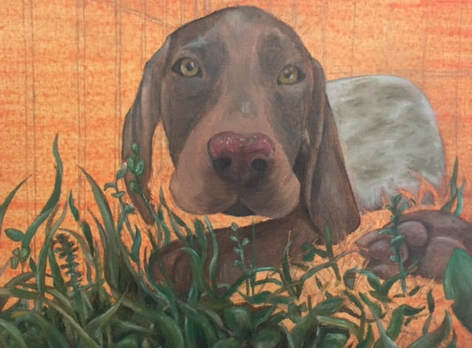
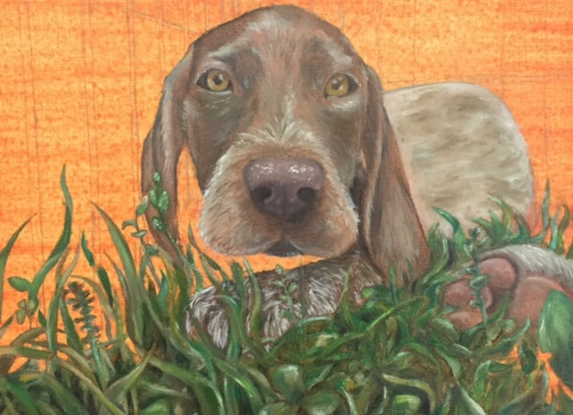
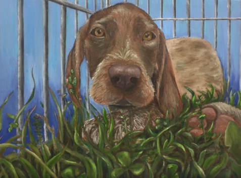
Since I didn't have a pet at the time, I texted a few friends and asked them to send me high quality pictures of animals they have taken. One of my friends sent me this picture which I LOVE due to the eye color, detail in the grass, and more. I painted this I oil, and for it being my second oil painting I've done, I think it turned out really well. I actually loved the end result of this piece. At first I was hesitant about the scruffy fur he had on his nose, and also I thought the grass all blended together too much. Looking back I'm very impressed with the depth I was able to create in the grass, and for the implied light I created by painting the whiter fur. My one big regret to this project was not really doing the background. I think I was worn out from doing the grass, so I just went with a solid background, and hoped people would think it looked like the sky, rather than me just getting lazy. I think if I go back to this project, I'll add in the legs of the people looking at the puppies. I think I like oil paint more than acrylic now. I usually get the desired look while using oil, and when I use acrylic it never really looks done. I'm 95% satisfied with this project, and I think it's one of my best.
|
|
|
|
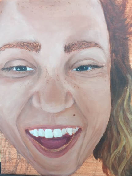
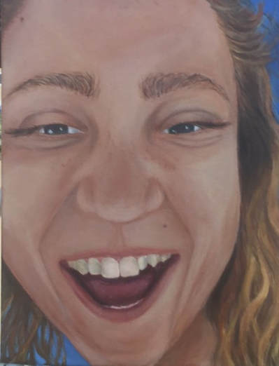
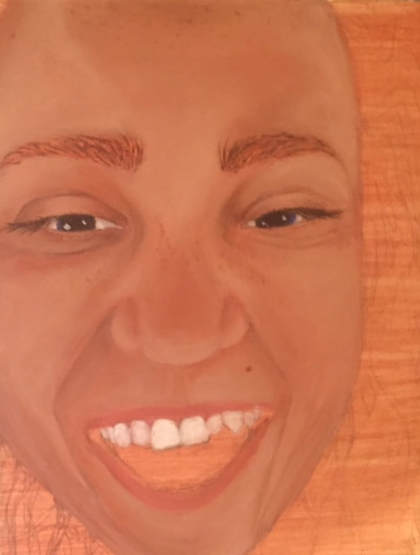
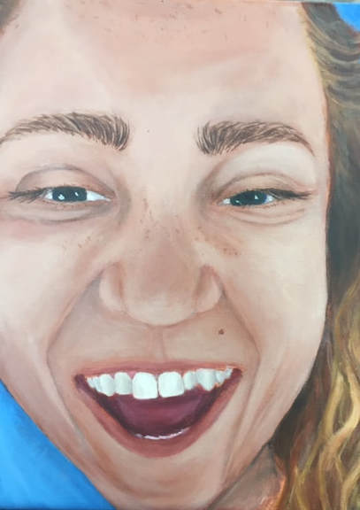
Self Portrait!
I think this painting turned out looking decent, but it didn't look as much like me as I would have liked. I couldn't get enough depth in my face. I think this was because I couldn't get the skin tone right to start with, so everything just felt off from that point out. I really don't like how this painting turned out. It was kind of a let-down. I think I want to re-do the whole thing at some point, and draw it with a grid so the drawing itself is more accurate, and also take my time mixing the colors, so I can get them as close to the real ting as possible. I also don't like how thick the eyebrows look, or how dirty the teeth look. I tried re-painting bot of these things countless times, but the teeth always looked to white, or they had no depth. The eyebrows always looked too dark to me, or didn't have the right kind of arch to them. The only part of this painting I actually liked was the movement in the hair. I think I portrayed that fairly well in this piece.
I think the photo choice was poor for this as well. I wish I would've picked something more interesting, like the clown picture I was thinking about, but too daunted by to actually use.
I recently painted another portrait, and I really love how that one turned out. I think I was overthinking everything while painting this picture, and trying too hard to make it perfect, and by doing this it messed up the painting in the long run.
|
|
Alternate Interior!
Since I took such a long time on the previous project, I'm still working on this one, and was unable to get the pictures off of my dads phone and onto this computer. (I'm started on the painting though, the pictures just weren't working) What I plan on doing is taking a different kind of approach, and using funky colors. I want to make it look almost abstract, but at the same time make it so you know what it is just by looking at it!
Once I finish/can get the pictures uploaded, I'll post them on here, and continue to explain my process and my struggles, and strengths.
Making Ordinary Objects Extraordinary!
A few days before we got assigned this project, my family bought a new house, and I decided I would take something ordinary, like a porch swing, and try to make it more interesting! I had a hard time with keeping up with everyone else. I took a very long time, trying to fix things that weren't really noticeable but I just knew about them because I had stared at them for so long. Although this was very time consuming, I'm glad I did it because it helped the overall look of the piece by A LOT. At the beginning of this project, Mrs. Rossi told me to use as little black as possible, because too much would overpower everything. She suggested using purples and blues. I really liked how that aspect turned out!
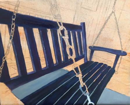
After painting this much I realized it looked kind of off because there wasn't really any colors but dark blue in the swing, so I had to keep layering highlights on the back of the swing to make it more colorful, and more realistic. I kept going, and no matter how much I tried to lighten up the bench it wasn't working. I think I was just over-mixing the colors. I eventually got that under control. My next dilemma was the ground. I thought it was too bright, and almost overtook the painting, so I painted it a shade darker, and had it fade into the color more.

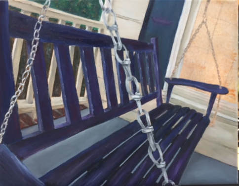
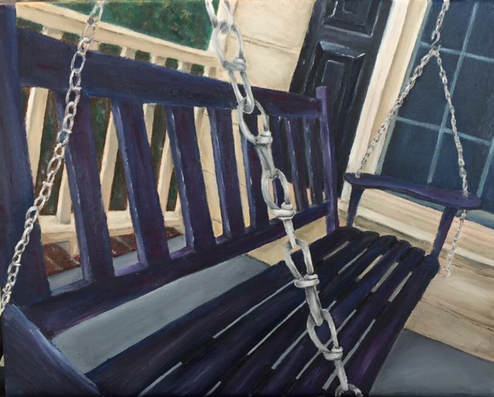
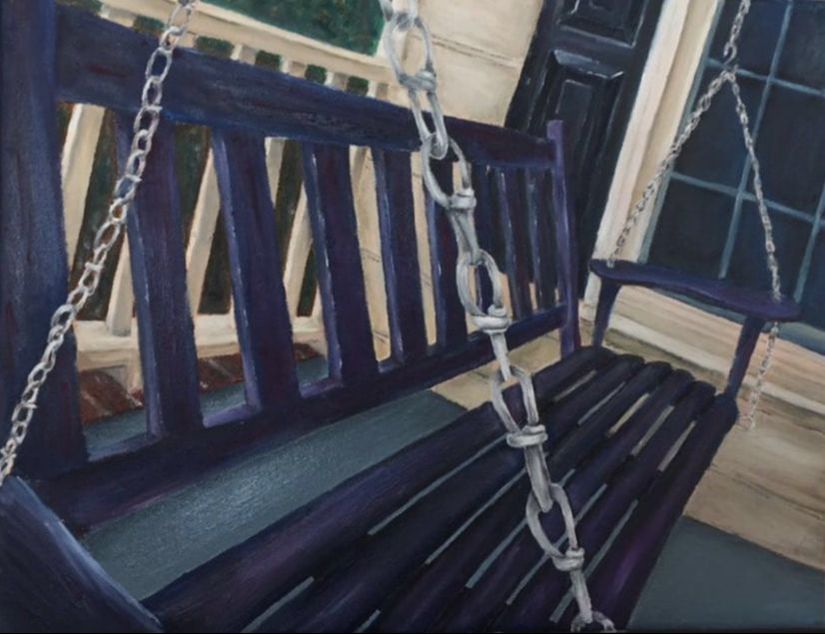
Overall, I really enjoyed oil paints. It was hard for me to step out of my comfort zone with them, but I liked it a lot! My favorite parts of this piece is the shutter, and the chain that cuts through the middle of the painting. I think I did a nice job making those stand out. For the shutter I added different colors, and added some nice highlights! For the chain I like how I distributed the black. I think I put the shadows in the right places to make it really look like metal!
I think if I had to do this project again I would want to try using different colors, and making it look more abstract. Or if I were to style it after the artist the painting was styling those 2D paintings after.
I think if I had to do this project again I would want to try using different colors, and making it look more abstract. Or if I were to style it after the artist the painting was styling those 2D paintings after.
As cheesy as it sounds, I believe that art is not just how something looks, but how it makes you feel. In a way it relates to the quote by Margaret Wolfe Hungerford: "Beauty is in the eye of the beholder." Just like everyone hasn't a favorite kind of music or a type of flower they think is most beautiful, everyone is entitled to theit own opinion on art. Art isn't such an individual thing that it doesn't have to make sense, or even look good to anyone else, as long as you like it.
I want people to see me as an artist who isn't confident in her skills, and as someone who puts the most emotion possible into my work.
I believe that expression and emotion are important in art because through this you are able to connect on a personal level with the people who see your work .
I think that what makes good artwork is when you can see the dedication and hard work the artist used to create their piece, and in a way, you can see their passion for art all over the canvas.
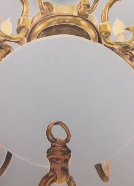
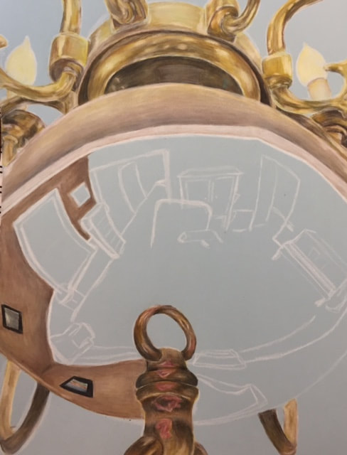
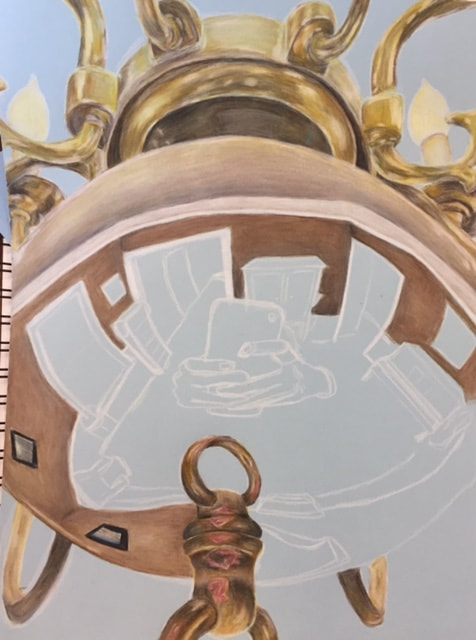
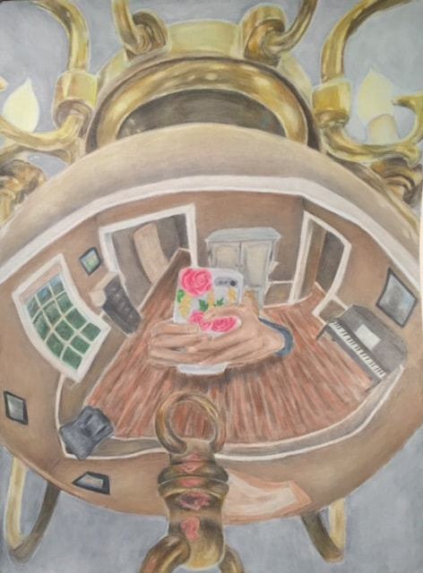
Reflections Project
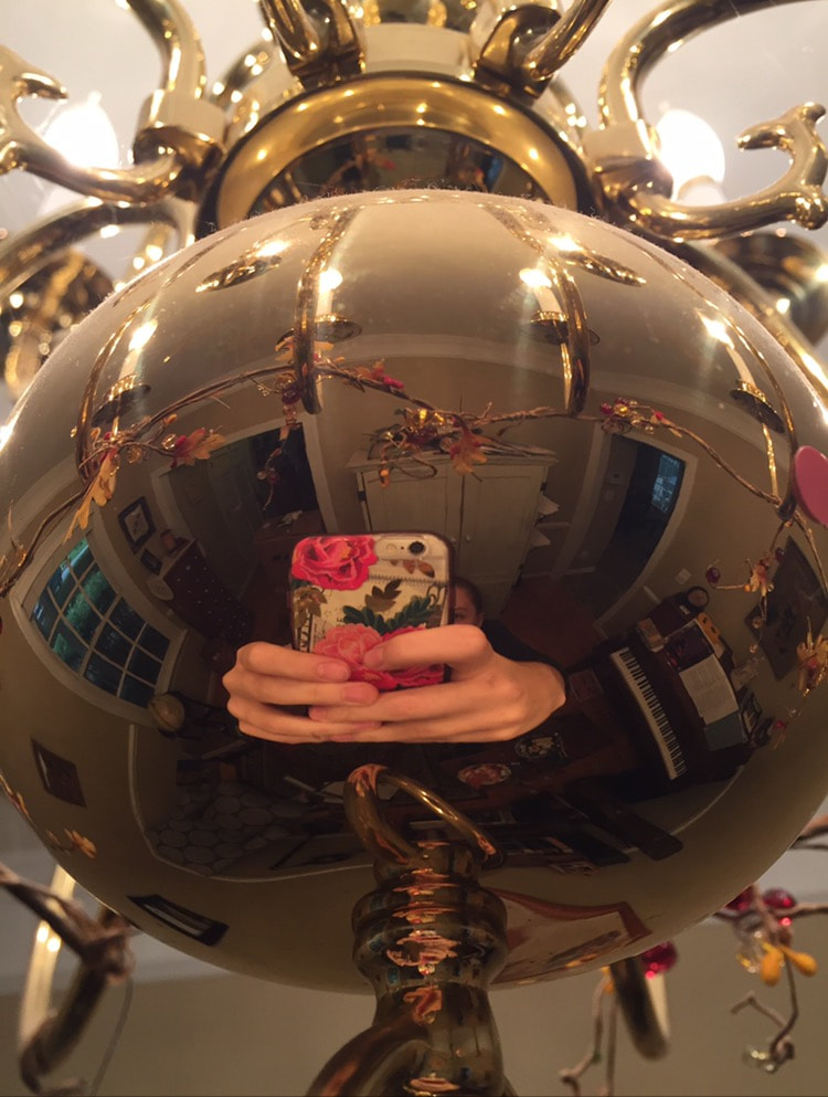
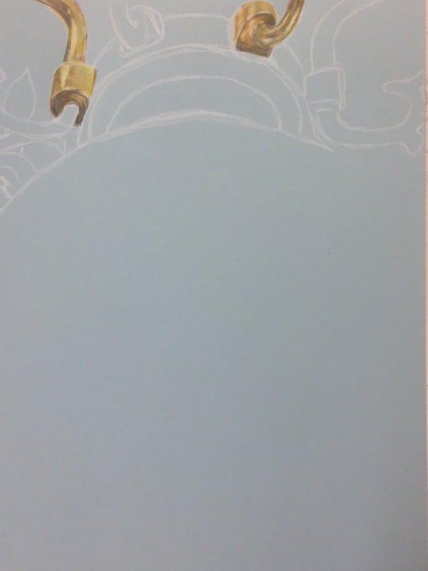
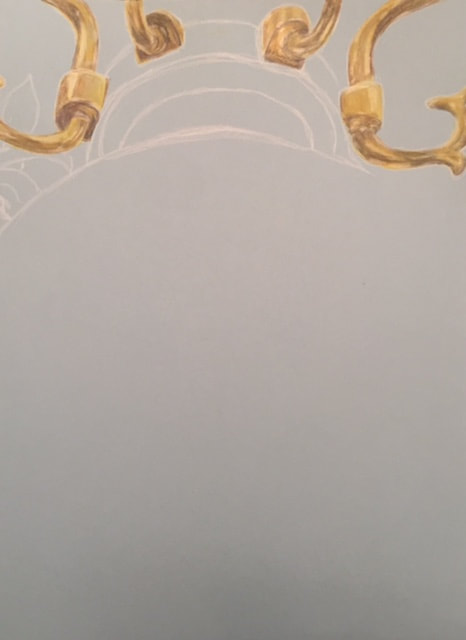
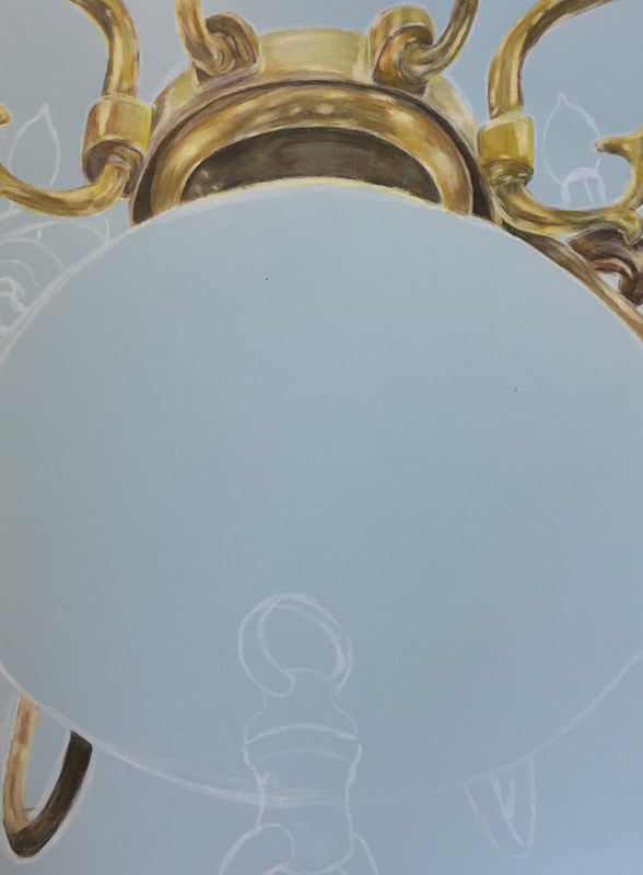
This past week, we were assigned a project where we were supposed to choose something that reflected our personalities and also literally reflected something else. I chose to draw my family's music room reflected in the chandelier. I thought this was a very challenging project due to the fish eye point of view the circular chandelier caused. It was really daunting at first, but after a while I grew more accustomed to what I was doing and was able to move more quickly, as well as make it look decent. I really enjoyed making the gold color. At first I was having troubles with this, but through a lot of layering, and mixing brown, dark yellow, bright yellow, gray, and white, I was able to pull of what I believe to be a somewhat realistic drawing of the gold from my reference. I struggled most with making the colors inside of the chandelier match with what I saw in my reference. This was extremely difficult, because you had to show the colors present in the room, but also add a gold haze to show that it was reflected on the chandelier. I don't think I accomplished the gold haze, but I do think I did a decent job making the colors match up. If I could redo this whole project, I would try to not make all of the colors look so muted. I feel like they all just look tired and dull. Overall, I really enjoyed this project, and challenging myself a little more than usual.
This past week, we were assigned a project where we were supposed to choose something that reflected our personalities and also literally reflected something else. I chose to draw my family's music room reflected in the chandelier. I thought this was a very challenging project due to the fish eye point of view the circular chandelier caused. It was really daunting at first, but after a while I grew more accustomed to what I was doing and was able to move more quickly, as well as make it look decent. I really enjoyed making the gold color. At first I was having troubles with this, but through a lot of layering, and mixing brown, dark yellow, bright yellow, gray, and white, I was able to pull of what I believe to be a somewhat realistic drawing of the gold from my reference. I struggled most with making the colors inside of the chandelier match with what I saw in my reference. This was extremely difficult, because you had to show the colors present in the room, but also add a gold haze to show that it was reflected on the chandelier. I don't think I accomplished the gold haze, but I do think I did a decent job making the colors match up. If I could redo this whole project, I would try to not make all of the colors look so muted. I feel like they all just look tired and dull. Overall, I really enjoyed this project, and challenging myself a little more than usual.